What are the design options for contact card?
Contact cards are a powerful tool for networking, building relationships, and leaving a lasting impression. Whether you’re a business owner, a freelancer, or just someone who values networking, your contact card is a tangible representation of who you are as a person or business. What are your design options when creating a contact card? Next, we’ll walk you through various contact card design options to help you create a contact card that stands out and effectively represents you or your business.
Design Layouts: Contact Card Classic Design vs Modern Design
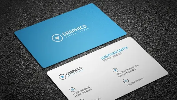
The first consideration when designing a contact card is the layout. The classic design features a simple and clean structure with a company logo or personal name at the center, followed by essential contact information such as phone number, email, and social media handles. This traditional approach remains a popular choice because of its professionalism and clarity.
On the other hand, modern layouts may involve creative use of space, unique shapes, and even non-traditional orientations such as vertical or square formats. Contemporary designs can incorporate more vibrant colors, striking typography, and customized illustrations. A modern design can convey innovation and creativity for businesses aiming for a trendy or avant-garde image. Choosing a classic or modern layout will depend on your brand or business’s style and message.
Typography and Font Choices: Making a Bold Statement
Typography plays a crucial role in the overall design of your contact card. The right font can instantly communicate your style, professionalism, and brand tone. A clean and legible font ensures that your contact details are easily readable. Standard fonts for contact cards include classic serif and sans-serif options, such as Times New Roman, Helvetica, and Arial, which lend themselves to a timeless and professional look.
For those looking to make a more personal or creative statement, handwritten fonts, calligraphy, or customized typefaces may be appropriate. These options can add a unique flair to your card but should be chosen carefully to ensure they don’t compromise readability. Additionally, font sizes should be balanced to create a hierarchy where your name or business name stands out. At the same time, secondary information like your contact details is still easy to find.
Color Scheme: Choosing the Right Tones for Your Contact Card
The cocolorcheme you choose for your contact card can set the tone and mood for how you or your business is perceived. For example, corporate colors such as navy blue, grey, and black communicate professionalism and trustworthiness. These tones are ideal for industries where reliability and formality are key, such as finance, law, or consulting.
For creative professionals or businesses in the tech, fashion, or entertainment industries, bolder color schemes with bright hues or gradients may fit better. ColouColorhology can also influence your decision—blue conveys trust and calm, while red is energetic and attention-grabbing. A good rule of thumb is to limit your primary palette to two or three color palettes so that the design remains cohesive and balanced.
Material Choices: Adding Texture and Durability
In addition to the design itself, the material of your contact card can leave a lasting impression on recipients. Traditional contact cards are made from standard paper or cardstock, but many premium options are available today that offer added texture and durability. Thick, high-quality cardstock provides a sturdy feel and conveys a sense of permanence and seriousness, ideal for professionals in more formal industries.
For a more luxurious and distinctive feel, you can opt for materials like matte, gloss, or soft-touch finishes, which give your card a tactile quality. Other unique material options include metal, plastic, or wood, which can instantly stand out from the usual paper-based designs. These materials are perfect for businesses or individuals who want to create a lasting impact and offer something truly memorable.
Incorporate Logos and Branding: Quickly Communicate Identity
Your logo is one of the most crucial elements of your contact card design. It should represent your brand identity in a simple yet recognizable way. Your logo’s placement—in the center, top-left corner, or elsewhere—can affect your card’s overall look and feel. Many companies place their logo at the top, followed by the contact details in a clear, readable format below.
Aligning your contact card design with your overall branding strategy is essential for businesses. This includes consistent colors, typography, and visual elements reinforcing your brand identity. A strong, memorable logo can increase brand recognition. When incorporated effectively into your contact card, it can immediately communicate your business’s or personal brand’s essence to those you meet.
Unique Design Features: Embossing, Foil Stamping, and More
To make your contact cards stand out, consider adding special design features that provide an extra layer of uniqueness and sophistication. Embossing raises the text or design above the card’s surface, creating a tactile, three-dimensional effect. This is particularly effective for emphasizing your name or logo.
Foil stamping is another premium option. Metallic foil is applied to specific areas of the card to create a shiny, attention-grabbing effect. This technique is often used for high-end business cards, where the goal is to convey luxury or exclusivity. Special features such as spot UV coating, die-cut shapes, or transparent elements can further elevate your contact card’s design, making it visually appealing and memorable.
Incorporating Digital Integration: Adding Scannable Features
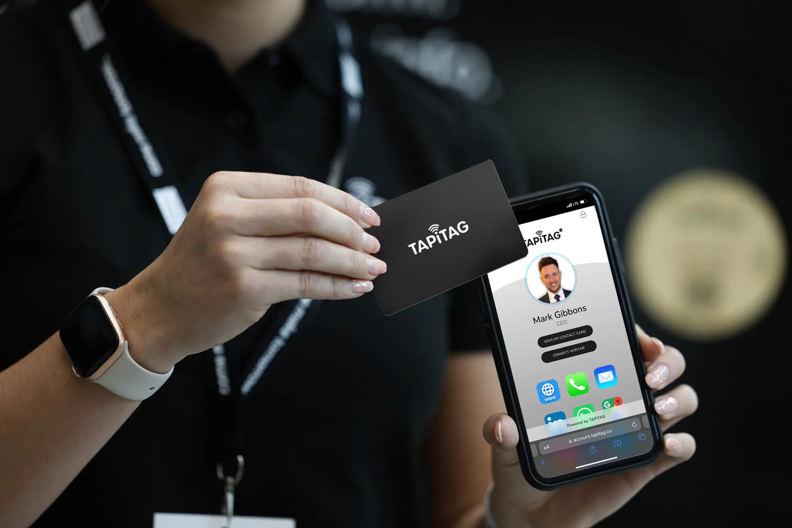
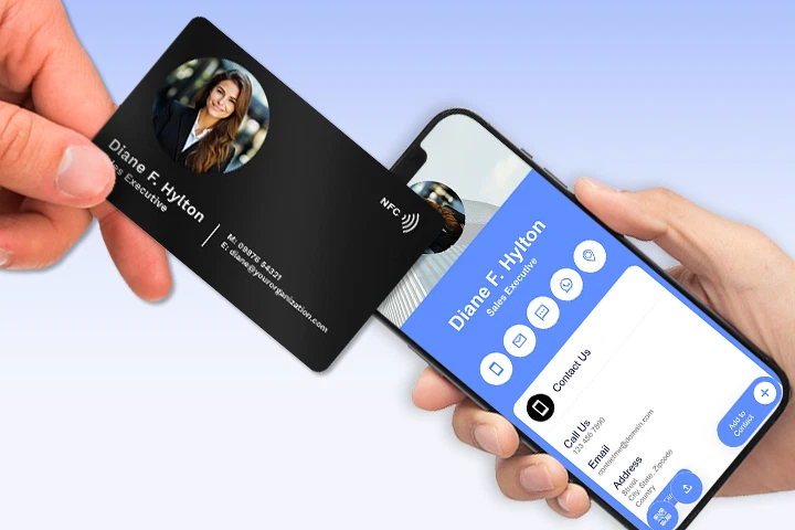
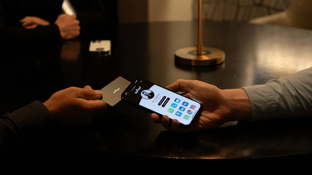
While a traditional contact card provides essential information in a physical format, today’s digital world offers ways to enhance its functionality. Scannable features such as QR codes or NFC (Near Field Communication) chips can connect your contact card to your digital presence seamlessly. QR codes can link to your website, portfolio, or social media profiles, allowing potential clients or collaborators to quickly access more information.
This digital integration offers an added convenience layer and can be particularly useful for businesses in technology, marketing, or any field where an online presence is critical. Combining traditional design elements with modern, tech-savvy features ensures that your contact card stays relevant and functional in the digital age.

Make a Contact Card That Works for You
Designing a contact card is more than just listing contact information. It’s an opportunity to showcase your personality, professionalism, and brand identity in a tangible form. By making strategic decisions about design options like color schemes, fonts, logo placement, and digital features, you can create a contact card that serves as a practical tool and represents your brand or personal identity.


